
Swipe tutorial
OKCupid

Project Overview
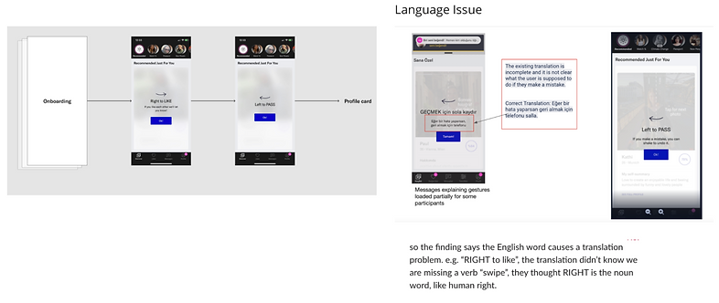
Problem
Based on research, we notice that oftentimes users tend to tap through the swipe directions after onboarding. This caused confusion as to how to “like” or “pass” a profile which ultimately took away from the user’s experience. In addition to the existing flow, other countries were having difficulty understanding the wording. “Right to like” was interpreted as “my right to like” so instead of a verb it was seen as a noun. My role as a designer was to restructure the existing flow as well as address the visual communication problems.
Solution
An updated experience that informs the user while maintaining a smooth yet timely flow
Conclusion
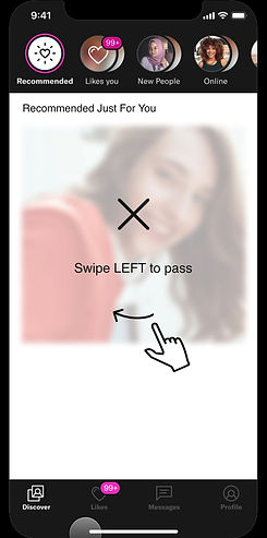
User experience was a major priority. I knew I wanted the new experience to be clear and seamless. I put different concepts together and with the assistance of other members of the design team. Some of the biggest updates included the addition of “Swipe” as a verb to address the confusion and enhance the overall user experience. I also crafted a tutorial consisting of a motion graphic encouraging the user to try out the new feature. The user could quickly get through the flow while subconsciously understanding the correct motions for both “liking” and “passing” a profile.
Role
Prototyping
Visual Communication
Comparative Research
Competitive Research
Product Design
Applications
Figma
Protopie
Existing Problem
To address this problem, the user experience was reviewed and analyzed. Later, I observed what worked and considered what needed improvement within the existing flow.
Research
The next step was to conduct research and understand other onboarding flows so that I could identify opportunities to better meet the user(s) needs. I first sampled non-dating apps like Canva to become familiar with common UX design processes.

Competitive Research
I chose to review competing dating applications.
- What questions are asked?
- What were our competitors doing differently?
- How time efficient was the onboarding process?
- What did they use to pass along information to the users after the process?
- What worked? What did not?

Brainstorm
After research, I put 2 different concepts together. My main priorities for these user flows
were simplicity as well as clear direction concerning how a user interacts with “liking” or “passing.”
Pro & Cons lists were made in addition to Low-fi wireframes.

User Flow
After the feedback provided by some members of my design team Hi-fi concepts were presented. Edge cases for internet connection and loading animations and icons were also presented. Some of the biggest updates included the addition of “Swipe” as a verb to dispense of the confusion and a short tutorial consisting of a motion graphic signaling the user to try it out. This interactive tutorial was to guide users through completing the task to help them understand the correct motion to “like” or “pass” a profile.

Prototype
In ProtoPie, I mocked up how the motion graphic would play out in the “Try it” tutorial for “liking” and “passing.” This effective motion design helped translate the directions to the users very seamlessly. The tutorial also addresses subconscious behavior for the user when “liking” and “passing.”

View More Projects